

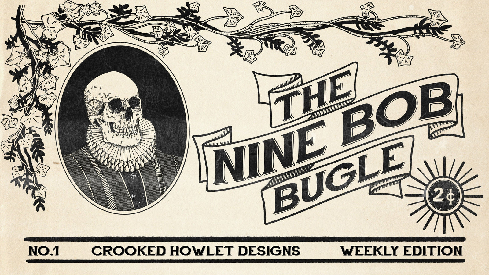
The Obsolete Designs, Part One
I like to think the change-over period, from the appreciation of canvas artistry to modern advertising, left a displaced pack of artists needing a dime, which led them to early packaging design and advertising artwork. Whether in their lineage or within their own lifetime, the transition from painting a fat broad holding a bowl of fruit, in oil, on canvas to designing fonts, logo's and early cigarette ads, made for some master work. This being said, a brief scratch beneath the surface could render my entire theory void, but for the time being, I'm running with it.
I don't feel this is the sly work of nostalgia, I believe if you go deep into vintage packaging design, before the digital era you'll find yourself some amazing work on some otherwise fairly mundane products.
Let's take my first example, Safety Matches. Probably the work of stiff market competition or even just a strange hub for art and design, these packages always used to deliver some tweaked, quirky and intricate design.

Look, it would seem out of place on the roof of the Sistine Chapel, but the designs always struck me as nearly overkill, for the hot headed twigs. Such a wild array of brands and imagery, from the 'infamous' Three Cats safety matches to a moose riding a penny farthing. There is either cultish meaning within the designs or a deliberate irrelevance between the packaging and the products within.

I don't necessarily draw inspiration for my ring collection through such outlets as these, however CHD does give me a vehicle to create some of those vintage designs that I love. Who knows where the brand will be in 1, 5 or 20 years, but I like the idea of having a bunch of CHD branded, completely irrelevant or obsolete products that we've designed artwork for.
So here leads to the Crooked Howlet Designs Safety Matches. Aside from our rings, I love the idea of a customer having a box of CHD matches, 20 years from now. Jewellery is one of those strange products that exists on a wave of significance. What I mean by this is, from that initial excitement when you first get your hands on the piece, to the growth of importance to you overtime and then hopefully handed down to your spawn. Jewellery and the vintage packaging designs we are working on, align on this one idea alone. We've got a long road ahead of us, before that status can be earned for both pieces, but settle in and sometime down the line, after a few warm beers and cold darts, you'll be telling someone the 'origins' of this jewellery and these matchboxes.
This is how our design came to life...

This was the original concept sketch.


Perched up in the CHD HQ:

- Ryan