Made With Purpose. Allowed To Age.

'The Mental Cheese Cloth'

Posted by Ryan Purdie on

The original document of our Mission Statement. 


So here it is, Crooked Howlet Designs Mission Statement is;
To provide the best blank canvas for experiences to be built on; by giving our jewellery purpose and the ability to have legacy.
 
It may not look like much, but this actually took years to perfect. I deliberated on the word 'ability' for months and now I feel it's the most important word in the statement. The ABILITY to have legacy is us both understanding our role as a brand and what customers require of us... without getting too over our skies and marketing our rings as 'heirloom' rings. They're not. They have the ability to be and it's our job to provide that capability to be held by the wear in the highest significance. We do this through building provenance, giving the pieces a defined cast date and therefore an age. We do through exclusivity. We also have the Ring Library that archives every single ring we make. 

But until a customer makes that crossover into seeing their piece through a different lens, which is the crossover from aesthetic to purpose, we are not going to force anything further on them. Nothing pisses me off more than these big jewellery labels marketing their new ring as 'The Heirloom Piece'... Pfft, is it mate? Good chance it's just going to be lost up a rectum the first weekend.

We appreciate that most of our customers just love the look of the design and they are looking to juice up their mitts. That's why we firstly remain product and design centric - articulated in the section 'provide the best canvas'. From there, the ability and purpose is built.


- Ryan
Founder

Read more →

Friday the 13th ODE, May '22

Posted by Ryan Purdie on

Guess who's back...

The 13th O.D.E, that's who. 


As I am sure you've picked up on this by now; we thrive off the exclusivity factor of our designs. From the monthly exclusives, boiled down to this even more intense short window - only one day to get your mitts onto this release. 


The exclusivity of these designs is to build a further intrinsic value into your piece - beyond the surface aesthetic. The idea of your particular ring design being cranked out and sold for years to come, we feel dilutes the significance of that little piece of metal perched on your knuckles.


What's the good worth of an heirloom if the company is still selling that design once you hand it on? Or no defined purpose or importance of that period it was sold for? There's still something to be said about the stories that you build into the ring yourself, however we want this to be shared by the select, dedicated few.


We also love the idea of worlds aligning and you bumping into a stray person on a night out that managed to slot into that 24 hour purchase opportunity, somewhere else on the planet and they also share the same heirloom. At least for us, that's something kind of special...
 
This year, there is only one '13th' landing on a Friday, which is coming this May.
 
So as always, we are doing our One Day Exclusive releases. Sold for 24 hours only and then never again. And due to the 'kick in the groin' of only having one Friday the 13th this year, we are going to launch a ring design, AND... a pendant!
 
The design is hot.
 
This isn't just some Vince McMahon hype, I mean it's once again, Jack Ankersen at his finest. Take a little taste of the original sketch (below)... Then leave the rest to us.
 
Keep yourself within arms reach, you won't want to miss this one.
Mates don't let mates miss ODE's. So let 'em know...
 
 
You know how it is - we launch the design 9:30am on Friday the 13th of August and we go through till 9:30am the following day. This is Australian Eastern Standard time.
 
It's a 24hr hit-out and the design will never sold again after this day.


See you soon...

- Ryan

Read more →

The 'Golden Ticket'...

Posted by Ryan Purdie on

The output of an idea, after being refined into the actionable tactics and communication channel, can often seem quite superficial. As many times they are. I have often come up with an idea an hour or so before executing. It can be a simple content action that really required not further depth. 
This concept was bread from so much more. It requires a long tail vision for what you want the brand to be. 
The Ring Library is cut from the same cloth. It's value won't be truly recongised for years to come. Which is honestly, our mission with the entire brand and more importantly, product. We understand that once you receive your piece of jewellery, Day One is the most insignificant. We've done our role up until that point, its then over to you. Our job is to then assist with the development of that significance, which comes through being a brand that you are proud to be associated with, by documenting the process and keep the record in our Ring Library. 


This latest concept was an amalgamation of the ethos of 'long term value' that we try to imbue in all our of brand strategy, as well as a thought of having a 'Golden Ticket' style promotion, in which we slip some style of Golden Ticket into random orders, which would instigate a prize of some sort. 
Deciding 'what' to slip into the orders, we came up with idea of having one of the CHD Designers do one of a kind sketches, all numbered and signed. No better than Jake Voroshine to run this one with. His simplistic style of illustrations with a strange profoundness and warmth to them, was ideal.

Once he finished these up and we looked at them, we then realised that, this is the prize. I nearly didn't want to run the promotion as these little pieces of artwork are so sick.  
When we marry this promotion up with the ethos of long term value for our customers, I picture the significance of one of these pieces 10 years from now. Imagine having an original piece of artwork from one of Gucci's designers back in the day... To me, that sounds pretty cool. 
Admittedly, we've got some way to go before the significance of these drawings will hold some real grunt to them. But so do you. You need to get out there and build some stories onto that piece of jewellery. So get to work, and so will we. 


HOW WILL IT WORK? 

This year, every week, we're going to drop one of these sketches into an order that ships out. 

If you get one, frame it. Hold onto the bastard nice and tight. I wanted it, but I've committed to this campaign, so you'll need to hang onto it for the time being. 


Let's call it, the 'NFT Reversion'.

I'm not against the new hype around NFTs, not in the slightest. But as its latched it's wagon to art recently, it's giving me a some a touch of nostalgia, in which I felt the need to showcase a bit of that tactical feel. The old-hand style of pen and paper, so we can one day say 'remember that'.

- Ryan


Read more →

Behind The Designer

Posted by Ryan Purdie on

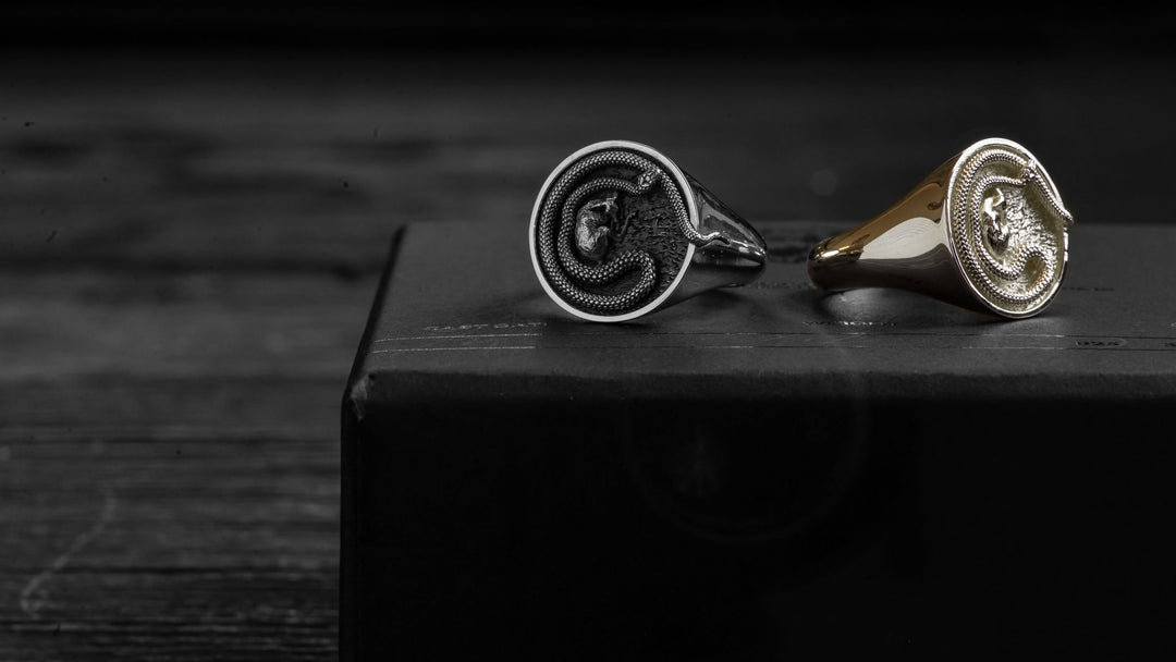
"... I saw the opportunity to present the other characteristic of snakes, their protective instinct."
- Justin.


What do you currently do for a living/study?

Studied Industrial Design Honours at Monash and currently working as an
automotive designer.


Outside of COVID times, what else do you get up to?

Either watching sports or playing sports usually soccer, takes up most of my free time, and if it doesn’t effect match day you’ll definitely find me partying in the city on weekends.

What was your favourite design (aside from your own, obviously) and who did you think would win?

Umm...I plead the 5th ....with two of my best mates entering the competition
I’m going to have to keep my answer a secret here I think for my own safety!


Let us know another brand that you follow on IG that our followers should check out...

Must be @derschutze_clo ! It’s a really unique clothing brand that uses colour shifting heat sensitive designs and similar to Crooked Howlet, each clothing item is a one day exclusive and is never made again.


Tell us why you decided to enter the Crooked Howlet Design Competition, and how you found out about it?

Obviously, Conor [last year's winner] and I are good mates and if anyone was going to dethrone the champ it was going to be me. He’s also how I found out about the comp as well.

Talk to us about your design background, are you self-taught or gone to art school, etc?

I’ve always been a guy that loves to draw whether at school or on the walls at home as a kid so its something that’s always been a part of my life. Also went through a few art subjects both in my school and university days.

What inspired your design? Talk us through the concept and the process from start to finish.

I was initially fixated on snakes and my ultimate goal was basically to incorporate a snake on the signet but in a unique fashion. There was plenty of google searching to understand the body of the snake better and the way it coils itself around various objects.

This gave me the idea of having it coil around the ring face as well creating a boarder around the ring. However, a snake on its own seemed too simple and maybe there was an opportunity to have more of a story to this snake.

I’m a fan of contrast whether it be colours or textures and even in this case, meanings to a story. This got me thinking of the contrasting image of a snake. More often than not we think of snakes as predators but maybe we could take a look at the flip side of that coin? I saw the opportunity to present the other characteristic of snakes, their protective instinct.

I researched what animals would commonly be considering prey and found an image of an elegant peaceful fawn. Combining the fawn within the centre of the coiled snake seemed to display this protective quality and the visual contrast I was looking for, while having the snakes head positioned looking away rather than towards the fawn also helped achieved this. With the ring face done I focussed on the rest of the ring to try tie the whole design together. I found many peoples submissions used some kind of image engraved onto the sides of the bands and wanted to do something slightly different. I imagined scales of a snake would be an interesting texture to have on a ring band but felt having them on the outside would ruin the effect of the ring face. Instead, I decided to add them to the underside of the band to be seen as a hidden detail for the user.

Lastly a little bit of photoshop rendering to finish the sketch put the final touches on the design and brought the entire concept together.


What does it mean to you to be the Winner of this competition?

It really means everything to have won this competition. As a guy who’s never been that fortunate, it feels incredible to have been able to win a competition up against so many talented people. I’m someone who tends to doubt myself a lot and winning this competition has also helped me have more self confidence in my own ability as well.


What is next for you?

With my design job now, having time for my own personal designs or sketching comes pretty thin. However, this competition has given me motivation to pursue more personal design work and not lose touch with sketching as a passion as well as for fun.


SHOP NOW


Read more →

Behind The Designer; Lyell Watson

Posted by Ryan Purdie on

'The two great unknowns...'
‘Two Worlds’, by Lyell Watson


What do you currently do for a living/study?

I am currently the Marketing and Content Coordinator for Jendamark, in South Africa.


Outside of COVID times, what else do you get up to?

I love to keep busy - so working on the farm, surfing, diving, fishing - if it's in the ocean or workshop - either way I’m happy! I started ByWatson during COVID - being freshly retrenched - it gave me the much needed downtime I needed to focus on something I have been passionate about for a long time. I started off by collecting the recycled & used wooden coffee stirrers from our local cafés and using glue and concept to create recycled wooden rings which people loved! This is what drove me to keep designing!

What was your favourite design (aside from your own, obviously) and who did you think would win?

This is a really tough question because - for me, there were SO many incredible designs. Concepts that were just epic! Choosing one - I would have to say that my favourite was “Bite me” by Emma Ramm – freakin’ loved that design. As for the win - I was stuck between Small world and Half-life as both were solid and well-designed concepts!


Let us know another brand that you follow on IG that our followers should check out...

I am obsessed with Juan Luis Zubizarreta’s work @spanishlordoftherings !! Definitely would recommend people give him a follow!


Tell us why you decided to enter the Crooked Howlet Design Competition, and how you found out about it?

A friend of mine introduced me to CHD some time back and I’ve been obsessed with the work ever since. I would get a notification whenever the page would update, so  when the competition came up I decided just to try, not thinking much would come of it - but what a cool platform to design something - especially with no limits. I honestly didn’t even think I would make the Top 50 - let alone become a Runner Up!


Talk to us about your design background, are you self-taught or gone to art school, etc?

I was raised in a family of traditional artists - but I was the only one interested more so in Digital Art & Design. No one taught me how to draw or how to conceptualize art - but I loved it and would often spend hours on Pinterest following pages for inspiration! I  started designing tattoos in high school and would often be asked to draw the competition T-Shirt Designs for local surf comps. I’ve always had a love for design and art and during 2017 - an opportunity came up and I was lucky enough to take up a position as the new Graphic Designer for GSM Trading SA (Billabong / Element / Von Zipper etc). I spent a couple of years there before moving to where I am now and haven’t looked back.

What inspired your design? Talk us through the concept and the process from start to finish.

Being very ocean and sea orientated, I'm often down at the beach doing something - be it surfing / diving - whatever. I even have a bell diver tattoo that I based my design off. I have ALWAYS been drawn to Bell Divers but - in the same breath i've also always had a fascination with the stars! So it was a no-brainer for me to take these two concepts and merge them in a kind of a ‘ying and yang’ sense. They are the two biggest unknowns of our world. Essentially two whole entire worlds of their own. They both hold so much beauty and fear, and I think that's really beautiful.

I started with designing each helmet to see if it would work as initially I wasn’t sure if they would - but they seemed to gel so I then just ran with it. It was such a fluid design process from start to finish, the final design submitted was basically the first version I drew up.


What does it mean to you to be Runner Up in this competition?

It honestly means the world, the amount of support from friends and strangers that showed up for my design shows me that I could be on the right track and that I could do it. A big validation for me.


What is next for you?

I would love to keep designing rings and jewellery and hopefully get enough capital and knowledge to grow my own company – it is a massive dream of mine to make quality jewellery that people love.


SHOP NOW


Read more →