Made With Purpose. Allowed To Age.

Pinky Piece III Release | JUNE 15th

Posted by Ryan Purdie on

"Anything, As Long As It Hugs This lil' Digit..."


There's a strange thing that I've picked up on during my time with CHD...

Two approaches with very different entry points, have shown to be the main settlement for shopping attitudes.

Here they are:

"I want THIS ring... It pumps. I love it... Now, what finger should I channel it on?"

OR, and this is big departure from the first approach...

"I need a ring for my pinky... I don't overly care what ring, just a pinky ring."

The nuance (might not even be that nuanced, but its a fun word to say, or type) here is that people either are focused on the ring or the pinky finger.

The focus on a particular finger, really doesn't extend beyond the pinky. Obviously unless its for a wedding ring. Even still, the ring's aesthetic plays more of a role than for the purpose of filling that little outside prodder aka the pinky.

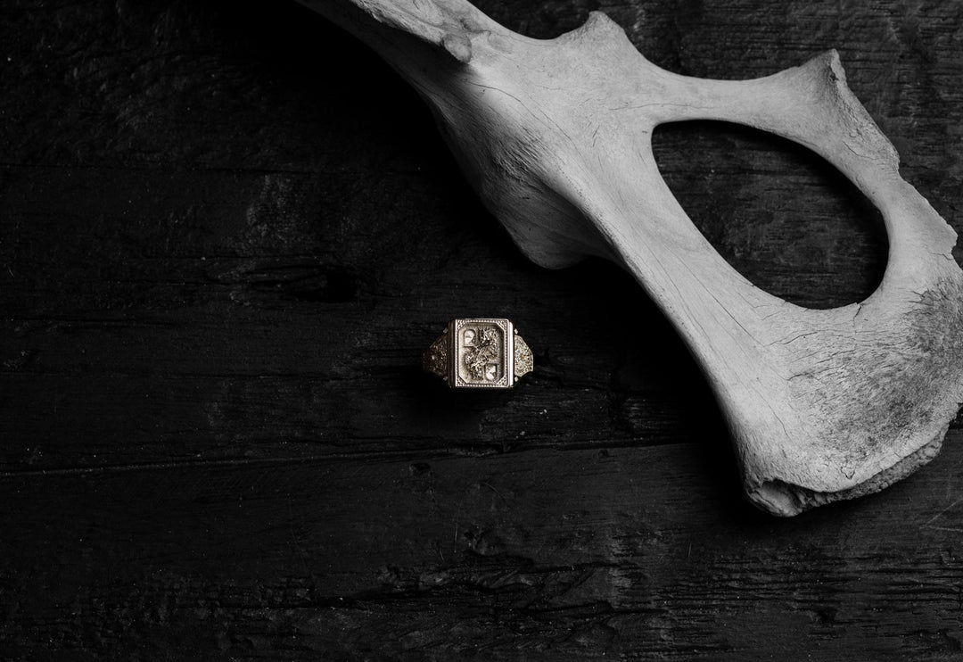
This realisation is what birthed the Pinky Piece Release. Coined in 2021, and we are now on the third year running. And by the Mother of Moe, it's a hot one again this year

This year, we've kept the core principles of a pinky ring strong and adapted further.


You want that flanking outer metal to be hugging flush to the fist. It needs to have a peculiar comfort to it. It needs to feel like you're wearing nothing at all.


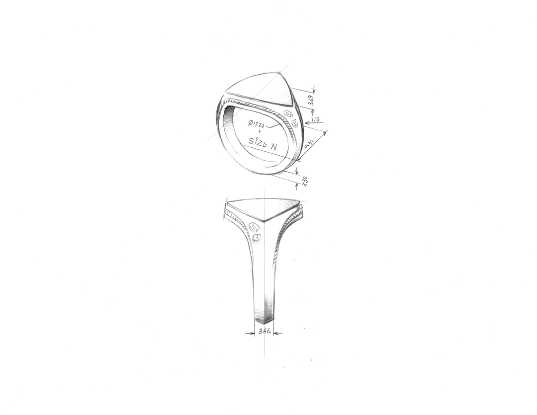
We've designed the piece to have a clean knife edge shank and a sunken rope detail.

As the pinky lacks girth and the knuckle structure to hold a piece securely on the finger like all the other digits, we've kept the face quite thin, which will allow it to tuck into the crease on the inside of the hand.

Then the features of the signet, flow with the contours of the hand.


Keep yourself stupidly close, we are releasing only 500 Pieces, then, never to be sold again…

 
Read more →

The Guardian

Posted by Ryan Purdie on

If you dig long and hard enough, you'll find a 'dark history' to almost anything. I'm racking my brain for an irrelevant, ridiculous example... But honestly, holding course might give us the best result.

Let me explain...


There is two ways to go about introducing the new Guardian Signet. I might even leave it up to you. A 'choose your own adventure' type of thing. Yeah that's a good idea... 

So if you want to FIRSTLY hear about why we chose this particular style for a signet, scroll down to the heading 2: "The Design Concept". But, if you want to hear more about the history of the Design Focal Point, keep reading right below...

Or if you couldn't give a fuck about either of these topics and want to just see the ring, then cuss me out, and scroll all the way to the bottom, scrolling so hard that it looks like you're giving an aggressive thumbs up to the person to your right. 

SO, here we go. 


The Design Focal Point

You've probably taken enough from my preamble to see where this is leading; the 'dark history'. But to be dead honest, it's not too grim. It's more just slightly humorous, doused with a reality of the times. 

The Athenians we actually the originators of the ol' door knocker. With the introduction of 'doors' to replace hangings - they begun to be irritated by guests arriving unannounced. So they needed a work-around to alert of them of the incoming pestery. 

(I love the Spartan's approach, which was to just shout their arrival whilst entering. I'm calling for a re-introduction of this style).

Now, to solve for the unannounced visits - the Greeks brought in a system of a 'door knocker'. Which was a slave, attached by chain, who's sole purpose was to answer the door on someones arrival. However, as they'd often pass out, there was a short iron bar that was used to knock on the door and wake up the slave.

Obviously, that bar was just then used as a weapon for home invaders. I believe they took 45mins to figure that one out, after only the second visit. So the iron bar was then secured firmly to the door, to make the style of 'door knocker' we know of today.

The lion head was one of the first sculptural designs for the door knocker, due to its cultural symbolism of strength, courage and protection. This dates back to the Ancient Greek and Roman periods.

It's a symbol that hasn't lost potency over the years, being adopted by traditions throughout the modern world as a figure of, Guardianship.

Allow it to be the front and centre, near the keyhole, at the line of vulnerability; the doorway. 


The Design Concept

Now, there is surely a line to draw between the focal point and the design concept - you'll stretch out that conduit to open that flow. But firstly, let me explain the design concept of why we chose this particular style. 

It’s a hard thing for a designer when trying to visually capture a concept that is a contextual experience and not easily translated through artwork or in this case, a piece of jewellery.

I’m not sure if just explaining the concept is an easy way out, but I feel it necessary for everyone to appreciate the familiar motifs that may look like weak designing.


Concept;
The origin stories for pieces of jewellery are a fickle mess of inconspicuous happenings...

I've always found this to be true and I'm doubting that I'm a sample size of one. 

Think back to questioning where someone has acquired a ring that you've noticed all of a sudden hugging their mitts. 

The answer is rarely delivered with lucidity. 

Whether it's a mishmash of memories that were rendered flawed through 'party' consumption or simply just an unceremonious arrival or departure from the previous host. As in, its slipped off and nestled in, unpronounced on a new home. 

Either which scenario, both resulting in the 'fuck, i can't actually remember ay...' when questioned on where they obtained that ring. 

Equally, there is a similar bewilderment when becoming aware of a treasured ring that you've now lost. Not knowing when or how, it's just begun a new existence elsewhere. 


So here brews a new concept, not far removed from Your Pa's designs... A piece that is design to be lost and rediscovered.

It's life will start with you, but it'll likely end up in a piss trough at some point. Or flung into the middle of a dance floor. Which will be ok. It'll find its way home. Trust me. 

We've designed this ring to resemble a ring of this style. It needed to be significantly notable; 'Oh yeh, that lion head ring you had'. It wasn't going to be overly complex or extravagant, but a bold symbol. Why? Because it needs to be easily adopted by the next wearer... The Lion Head crosses all cultural lines and has consistent relevance through the ages. 


The hallmarks secure its bearing on you, here and now. 

Around the rim reads; "Howlets Wing & Lions Mane". Which is our rendition of the original Shakespearean quote that birthed the Howlet brand name; "The Howlet's Wing & Lizards Leg".  

Now, let me introduce,

The Guardian.


Read more →

'The Ace Up The Sleeve'

Posted by Ryan Purdie on

You may have heard us allude to this earlier in the year... The ol' wild card. 

Again, excuse these puns, it is genuinely impossible to avoid. Every expression that I look for to frame an upcoming campaign seems to have a connotation within playing cards. I never knew how engrossed playing cards were in descriptive discourse.


So, seeing as its unavoidable, let me introduce, the 'Ace Up The Sleeve'.
Wild Card Release on February 15th, as a new 'One Day Exclusive Pre-Release'. 


What does that mean? Good god, I'll tell ya'

We've wanted some residue from this year's monthly exclusive collaboration to remain and fly the flag as we go into next year. However, the Monthly Exclusives need to hold true to concept and be sold for that month only. So we figured, let's release the Four Ace's collection next year and in the meantime, to pump hype-tires, we thought a One Day Pre-Release would raise the pulses. 


So, we'll be releasing the Ace of Hearts on February 15th, for ONE DAY, a 24 Hour hit out - but then next year, we'll be releasing the full four aces range. 
We'll of course keep some exclusivity to this year's design and have limited release engravings, numbered pieces 1/.... and authenticity certs.  
This is so you can lord if over the class of 2024, who get on it next year. Know what I mean? Course you do...

So for the love Bluetooth (a viking pirate, that bluetooth was actually named after; cool fact huh) - stay close. This drop is a blatant heater. 
 
Read more →

Who Is Nick Potts...?

Posted by Ryan Purdie on

WHO IS NICK POTTS?

“Describe yourself in three words…” 

Anyone who even opens their gob to answer that, is a complete ball bag. 

Yet, I usually find myself asking resident designers this exact question - in reference to their style. 

Of course they’re going to look at me sideways. But let me give it a nudge, and slowly unravel who NP is and what is this design style. 

Watch me try and sum his style up in one sentence, then allow me to meander on down the poetic wank trail. 


If space had a 70’s… NP would be its artist.  

What I’m saying is, his style is a cordial of mystical-Woodstock flare, with a star gazing lens. 

The artwork pulses up through his utensils, into his swede tassels. There’s no departure of the artist from the artwork. NP is a walking depiction of his style. The farm dwelling through-back and stupidly talented, Mr Potts. We can’t wait for this year to continue to play out. 


THE COLLAB

Its extremely rare that working with any creative is a pony ride. I’m speaking from the position of a creative myself… Good god, we’re a fickle cordial of contradictions and lack of organisation. Alterations and re-clarifying briefs are the norm.

However, for this and I don’t why… we just work. This collaboration, and all the collaborations in the past, really just work seamlessly.  

NP will take a concept, as entry level ‘day one’ sort of stuff, and run with it - and extremely rarely does ever need the bumpers to realign the direction. He will absolutely nail the weak brief and turn it into something that far exceeded my vision. 


This concept couldn’t have landed better. I said this last post, but I genuinely believe this deck of playing card is the sickest deck of cards I’ve ever seen. You better have the foresight to see an exclusive release of these decks coming… If you don’t, get to know us!

His flare is well adapted in the CHD flavour. Obviously, there was some skullduggery in the mix - but just the general, the vintage deck of cards already has a mystical code that aligns well with both of our styles. I’m putting this down to; playing cards always being present in nefarious situations. 

Think of any scenario, both in real life or on the big screen, that cards are present… There’s some riff raff present. Or very near by. 

This aspect alone, is what makes this collab pop. 


I’m so pumped to have NP onboard for this year. Again, I don’t know what we were thinking casting a wide net when a long term artist in residency, and good friend, NP was lurking within pens reach. 

So here we are, The Hand You Were Dealt; The 2023 Monthly Exclusive Collaboration.


SHOP NOW
 

Read more →

Introducing, The 2023 Monthly Exclusive Collaboration...

Posted by Ryan Purdie on


This year's Monthly Exclusive collaboration has a unique tweak that genuinely has me the most excited for a years collection. 


Every year, when we unravel the resident artist for the Monthly Exclusives, there is an obvious expectation for the designs to be of such an incredible standard, that it will be hard to miss. One thumb-flick through their Instagram and you've got a good understanding of the flare that will be coming over that year's months. 
However, this year, we've coupled the mastery of Nick Potts with a proper amazing campaign concept that we've had simmering away for a while. 


So let us introduce the 2023 Monthly Exclusive artist; Nick Potts. IF you can effectively describe his style, then I'm sure he'd love to know! Because, good god, we've tried and never done it justice. 
We've been working with Nick Potts over the years and it made so much sense to link up for the 2023 Monthly Exclusives and to build out the concept that we have for this year, which is....


THIS YEAR, in collaboration with Nick Potts, the Monthly Exclusives are designed with our rendition of a deck of cards. We'll go through each suit and a new face card every month. 


So it will be the King, Queen & Jack - in Spades, Hearts, Diamonds and Clubs. 12 Cards all up. The perfect collection.


This will be the breakdown;

JANUARY - We kick things off with the King of Spades ♠️

FEBRUARY - Queen of Spades ♠️ (as well as additional featured design)

MARCH - Jack of Spades ♠️

APRIL - King of Hearts ♥️

MAY - Queen of Hearts ♥️ (as well as additional featured design)

JUNE - Jack of Hearts ♥️

JULY - King of Clubs ♣️

AUGUSTQueen of Clubs ♣️ (as well as additional featured design)

SEPTEMBER - Jack of Clubs ♣️

OCTOBER - King of Diamonds ♦️

NOVEMBERQueen of Diamonds ♦️ (as well as additional featured design)

DECEMBER - Jack of Diamonds ♦️


The cards are all legitimately the best playing cards I have ever seen, so there's a good chance that we create a full deck as well, potentially do a small run of these. 

But either way, the designs translate so well into the ring design and I couldn't be more excited to release these things. Believe me, if you find appeal in Howlet in the slightest, this collection will blow you away. 

I feel a bizarre tribal feeling for my birth month, August. Almost a sporting team support for the design that will come out for that month. 


and can't wait for it to role around to get onto that design. The Queen of Clubs, is going to front and centre of my ring collection from here on out. 

Read more →